reading-notes
HTML & CSS
Responsive Web Design
The practice of building a website suitable to work on every device and every screen size, no matter how large or small, mobile or desktop. Responsive web design is focused around providing an intuitive and gratifying experience for everyone. Desktop computer and cell phone users alike all benefit from responsive websites.
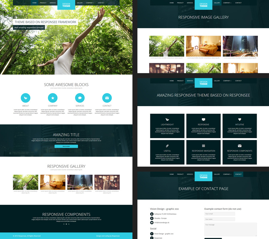
Responsive web design is broken down into three main components, including flexible layouts, media queries, and flexible media
- Flexible Layouts
- Flexible Grid
- Media Queries
All About Floats
Float is a CSS positioning property.

-
This same layout could be accomplished using relative positioning on container and absolute positioning on the avatar as well. In doing it this way, the text would be unaffected by the avatar and not be able to reflow on a size change.
-
Clearing the Float Float’s sister property is clear. An element that has the clear property set on it will not move up adjacent to the float like the float desires, but will move itself down past the float. Again an illustration probably does more good than words do.

Clear has four valid values as well. Both is most commonly used, which clears floats coming from either direction. Left and Right can be used to only clear the float from one direction respectively. None is the default, which is typically unnecessary unless removing a clear value from a cascade. Inherit would be the fifth, but is strangely not supported in Internet Explorer. Clearing only the left or right float, while less commonly seen in the wild, definitely has its uses.
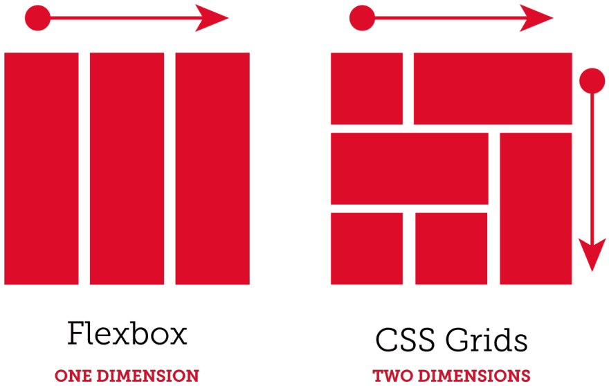
Grid
The vast majority of websites out there use a grid. They may not explicitly have a grid system in place, but if they have a “main content area” floated to the left a “sidebar” floated to the right, it’s a simple grid.
If a more complex layout presents itself, people often reach for a grid framework. They assume grids are these super difficult things best left to super CSS nerds. That idea is perpetuated by the fact that a lot of the grid systems they reach for are very complicated.
for more information visit this site

CSS Floats Explained By Riding An Escalator (summary)
- Your
<div>is almost perfect. You decide to introduce some floats to fix the relationship between a few elements. - There is a left flow and a right flow, and the elements that are not floated can easily fill the space that is not taken by the floated elements.
- the
floatproperty also gives an indication of an element’s relationship to surrounding elements. Clear: allows elements to specify where they should align in comparison to the floated elements.- One of the most frequent uses of the clear property is
“clear:both”. This allows you to reset the flow of elements, as opposed to continuing to maintain a right, left and normal flow.
SMACSS Official Documentation (summary)
SMACSS refers to scalable and modular architecture for css
SMACSS is becoming one of the most useful contributions to front-end discussions in years
It is a flexible guide for developing sites
- SMACSS is more style guide than rigid framework. There is no library within here for you to download or install. There is no git repository for you to clone. SMACSS is a way to examine your design process and as a way to fit those rigid frameworks into a flexible thought process. It is an attempt to document a consistent approach to site development when using CSS.